
This post contains the handout of the lab I gave on explicit Custom Nodes in C# at the Dynamo User Group Computational Design Workshop in Sydney on the 2nd of December 2017 . You can find source files on GitHub.
Summary
This workshop will teach you how to set your graph free by developing explicit nodes with a custom UI. This approach is more advanced and complicated than the Zero Touch one, but nodes built this way have the most flexibility and power. You will learn how to implement a custom UI, respond to other nodes and affect the state of the graph. You will also learn how to package your nodes and distribute them using the Dynamo Package Manager. The workshop be using Visual Studio and C#, an intermediate level of programming knowledge is needed, for additional information see the links in the Additional Resources section.
Learning objectives
- Learn how to develop, test and deploy explicit custom Dynamo nodes
- Learn how to implement a custom UI
- Lear how to publish your nodes using the package manager
Tools we’ll use
- Visual Studio Community 2017
- Autodesk Revit 2018 (or Autodesk Revit 2017 and Dynamo 1.3)
Getting started with WPF
In the previous lab we have seen how to develop Zero Touch Nodes, which are great to add custom functionalities, but do not give us total control over the node’s behaviour. In order to customize its UI, and to affect the state of the node and the graph an explicit custom node is needed. Explicit custom nodes are more complex and use Windows Presentation Foundation (WPF) a powerful framework for building Windows applications.
Sample App
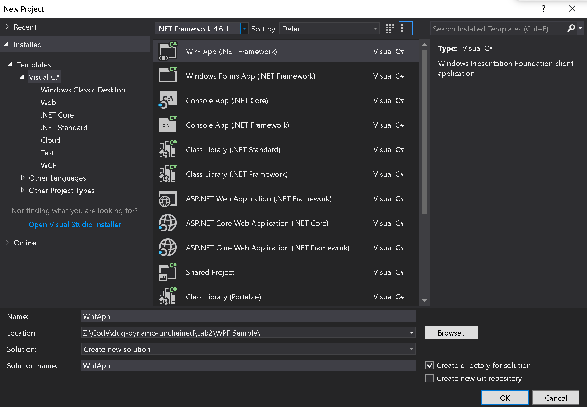
Let’s first make a simple WPF application, to see how it works. Open Visual Studio and create a new WPF App project:
Now double click on MainWindow.xaml, expand the toolbox panel and add some UI controls as a slider, a checkbox and a button:
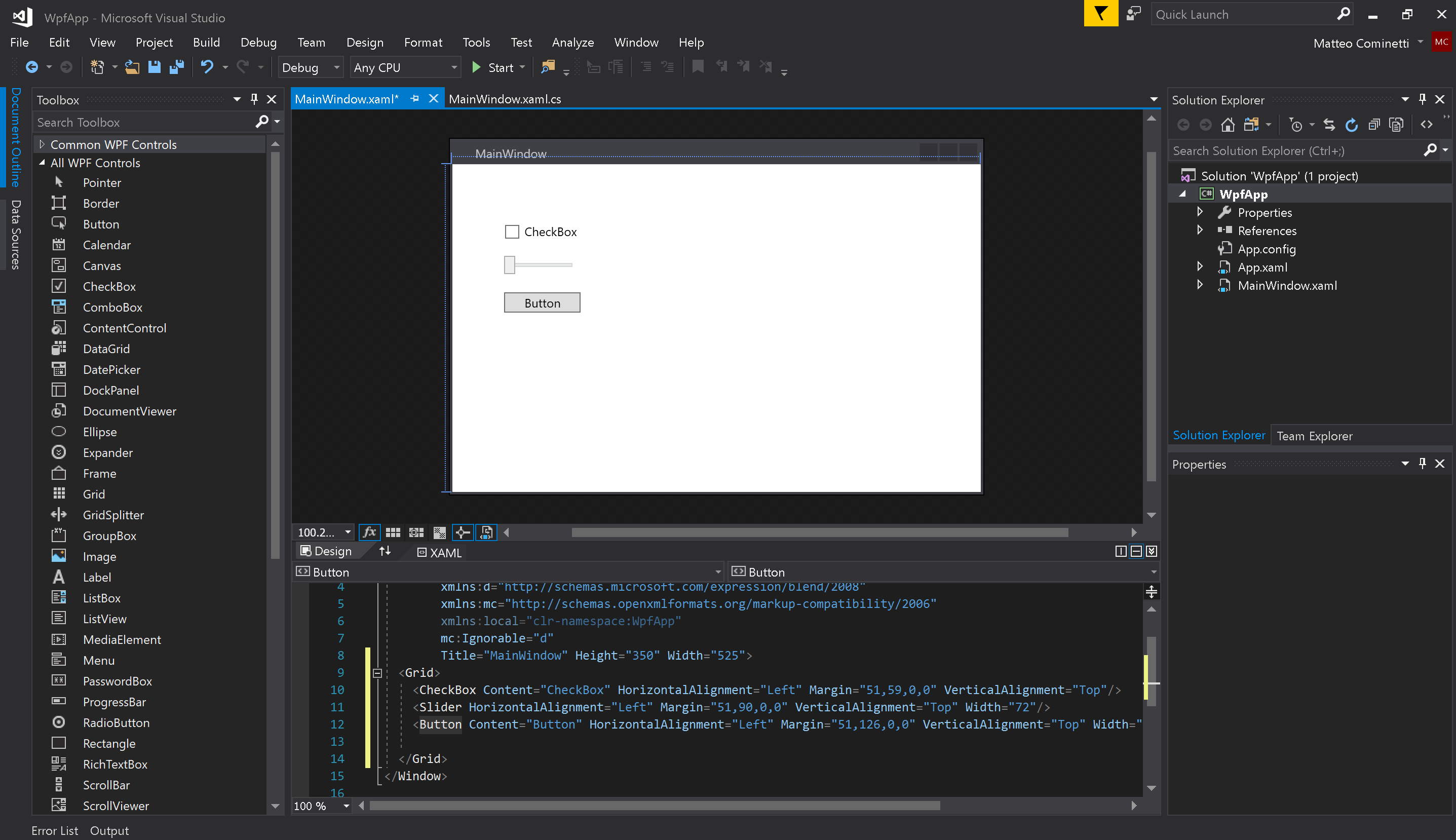
As you see VS has automatically created XAML tags corresponding to these UI elements, let’s now edit it so that from these controls we can call methods in the C# code behind. We are going to add names to the controls, set Grid.RowDefinitions to better layout the controls, change a few properties and add a Click event to the button:
<Window x:Class="WpfApp.MainWindow"
        xmlns="http://schemas.microsoft.com/winfx/2006/xaml/presentation"
        xmlns:x="http://schemas.microsoft.com/winfx/2006/xaml"
        xmlns:d="http://schemas.microsoft.com/expression/blend/2008"
        xmlns:mc="http://schemas.openxmlformats.org/markup-compatibility/2006"
        xmlns:local="clr-namespace:WpfApp"
        mc:Ignorable="d"
        Title="MainWindow" SizeToContent="WidthAndHeight">
  <Grid Margin="10">
    <Grid.RowDefinitions>
      <RowDefinition Height="Auto"/>
      <RowDefinition Height="Auto"/>
      <RowDefinition Height="Auto"/>
    </Grid.RowDefinitions>
    <CheckBox Grid.Row="0" Margin="5" Name="EnabledCheckBox" Content="Enabled" HorizontalAlignment="Left" VerticalAlignment="Top"/>
    <Slider Grid.Row="1" Margin="5" Name="ValueSlider" HorizontalAlignment="Left"  VerticalAlignment="Top" Width="100"/>
    <Button Grid.Row="2" Margin="5" Click="Button_Click" Content="Click me!" HorizontalAlignment="Left"  VerticalAlignment="Top" Width="75"/>
  </Grid>
</Window>
Now in the code behind (MainWindow.cs) we can add the following function that will show up a ‘MessageBox’ with the slider value when the button is clicked:
private void Button_Click(object sender, RoutedEventArgs e)
{
  MessageBox.Show("Value is " + ValueSlider.Value);
}
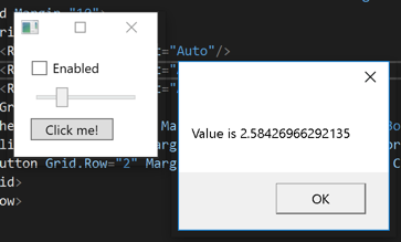
Run the application and you’ll see it working!
WPF Binding
A very powerful feature of WPF is binding, it provides a simple and consistent way for applications to present and interact with data. Let’s see what it means with a simple example, edit your button XAML code by adding IsEnabled="{Binding ElementName=EnabledCheckBox, Path=IsChecked}", it will look like:
<Button
  Grid.Row="2"
  Width="75"
  Margin="5"
  HorizontalAlignment="Left"
  VerticalAlignment="Top"
  Click="Button_Click"
  Content="Click me!"
  IsEnabled="{Binding ElementName=EnabledCheckBox, Path=IsChecked}" />
If you run the app you’ll see that as the checkbox is unchecked the button becomes disabled, we have bound the checkbox IsChecked property to the button status. Binding not only works between components, but also with the code behind.
User Controls
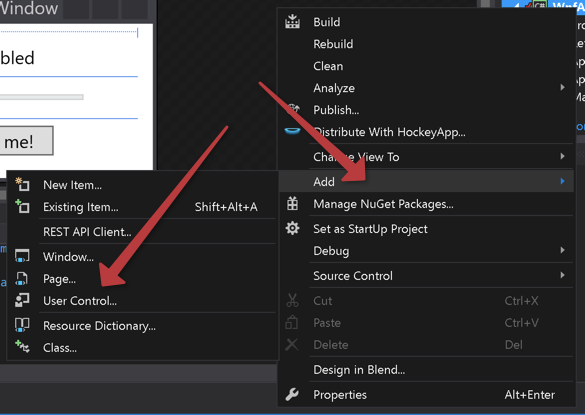
Let’s finally see how easy it is in WPF to create custom controls, right click on the project > Add > User Control and create a new one, I named mine MyCustomControl.xaml.
Now, from the XAML panel replace the content of <Grid>...</Grid> in MyCustomControl.xaml with the one in MainWindow.xaml. As do the same for our Button_Click function in MainWindow.xaml.cs and move it to MyCustomControl.xaml.cs.
We have now created a reusable custom control that we can embed inside other WPF controls. To add it to MainWindow.xaml we just need to save and add the ` xmlns:local=”clr-namespace:WpfApp” attribute to the
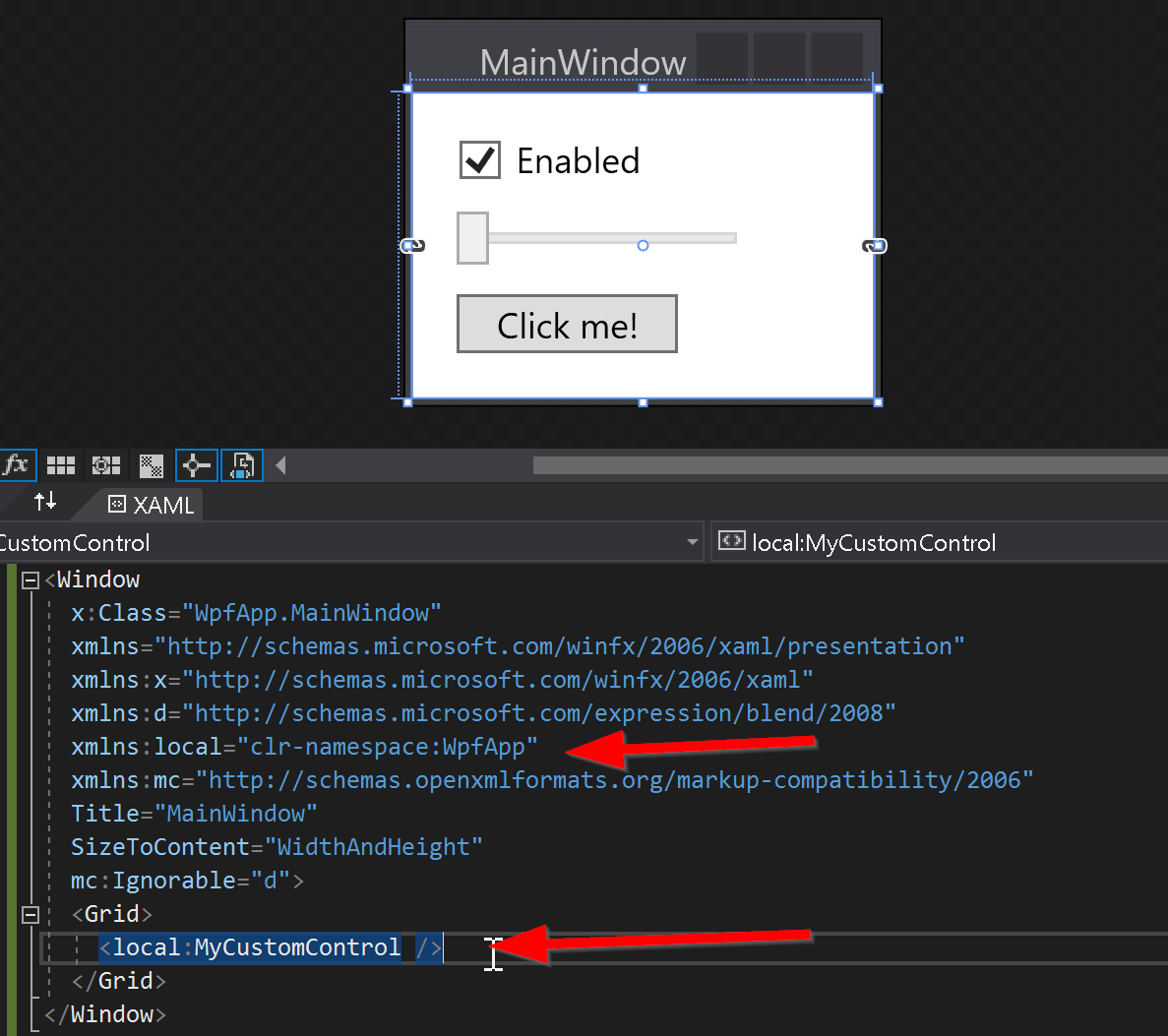
If you build and run the application you’ll see it behaves exactly how it did before.
Explicit custom nodes - part 1
Let’s now see how to use our User Control inside a custom UI node. Open the empty project inside DynamoUnchained.ExplicitNode - start, this was set up in the same way we did in the previous lab, the only additional dependency, which can be installed via NuGet, is the WpfUILibrary:

The NodeModel interface
Custom UI nodes implement the NodeModel interface, the same way native nodes do. An interface is like an abstract base class, any class that implements the interface must implement all its members. Basically you’ll just have to add :NodeModel after the class name, and have certain functions in your class.
Create a new class named HelloUI.cs, then add the interface, directives and attributes as below:
/* dynamo directives */
using Dynamo.Graph.Nodes;

namespace DynamoUnchained.ExplicitNode
{
  [NodeName("HelloUI")]
  [NodeDescription("Sample Explicit Node")]
  [NodeCategory("Dynamo Unchained.Explicit Node")]
  [IsDesignScriptCompatible]
  public class HelloUI : NodeModel
  {
    public HelloUI()
    {

    }
  }
}
In explicit nodes there is no need for a _DynamoCustomization.xml file, as the attributes on top of our class will define its category.
The Custom UI
We have already written a sample custom UI to implement in the sample WpfApp project, now we just need to copy MyCustomControl.xaml and MyCustomControl.xaml.cs to the current project folder and add them to the project, you can do this by dragging and dropping them:
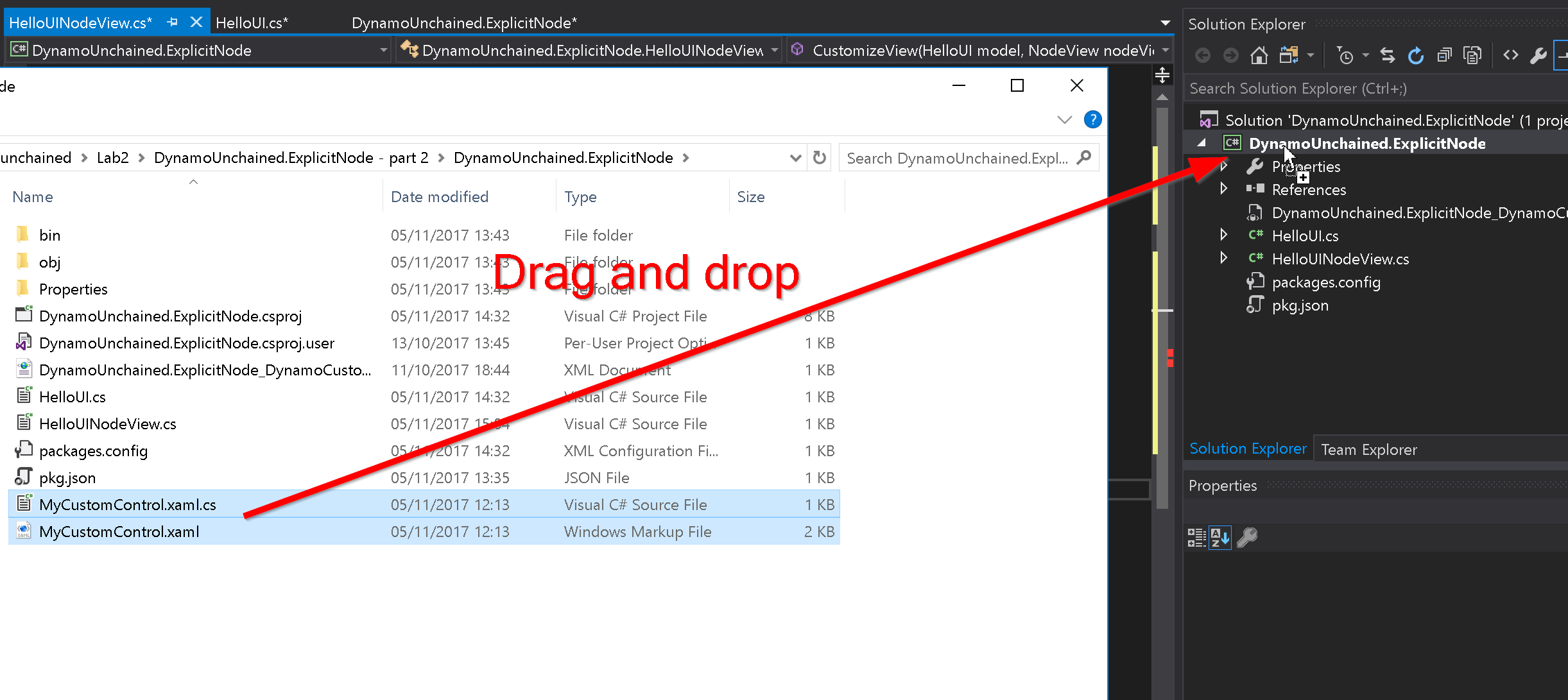
You’ll also need to replace the namespace in those two files, from WpfApp to DynamoUnchained.ExplicitNode.
The INodeViewCustomization Interface
Since our node has a custom UI, we need to create another class which implements the INodeViewCustomization interface. Create a new class named HelloUINodeView.cs and add:
/* dynamo directives */
using Dynamo.Controls;
using Dynamo.Wpf;

namespace DynamoUnchained.ExplicitNode
{
  public class HelloUINodeView : INodeViewCustomization<HelloUI>
  {
    public void CustomizeView(HelloUI model, NodeView nodeView)
    {
      var ui = new MyCustomControl();
      nodeView.inputGrid.Children.Add(ui);
      ui.DataContext = model;
    }

    public void Dispose()
    {
    }
  }
}
The code above is assigning the custom view to the HelloUI NodeModel and binding the data.
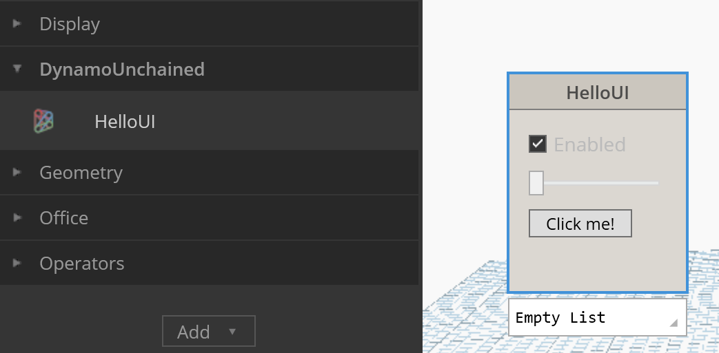
If you debug, you’ll see the node with the user control embedded, behaving as before, but without any input or output port. If you’ve missed any step you can find this completed part in the folder DynamoUnchained.ExplicitNode - part 1.
Explicit custom nodes - part 2
In this final part we are going to add input and output ports to our node and interact with the graph. The following part is going to sound a bit confusing, but that’s how Dynamo works in the background.
Executing functions
NodeModels when executed run a method called BuildOutputAst this method takes your inputs and passes them to a function which has to live in a separate assembly (in our case a separate project). Let’s create it:
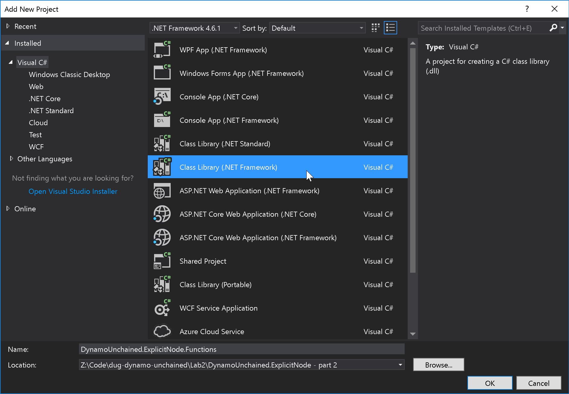
Then let’s add the DynamoVisualProgramming.DynamoServices NuGet package and a new static class named Functions.cs:
using Autodesk.DesignScript.Runtime;
namespace DynamoUnchained.ExplicitNode.Functions
{
  [IsVisibleInDynamoLibrary(false)]
  public static class Functions
  {
    public static double MultiplyTwoNumbers(double a, double b)
    {
      return a * b;
    }
  }
}
The BuildOutputAst Method
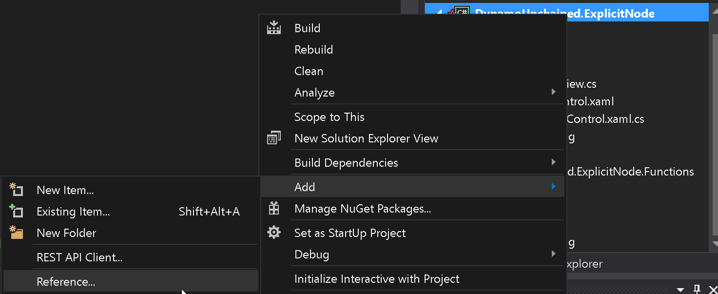
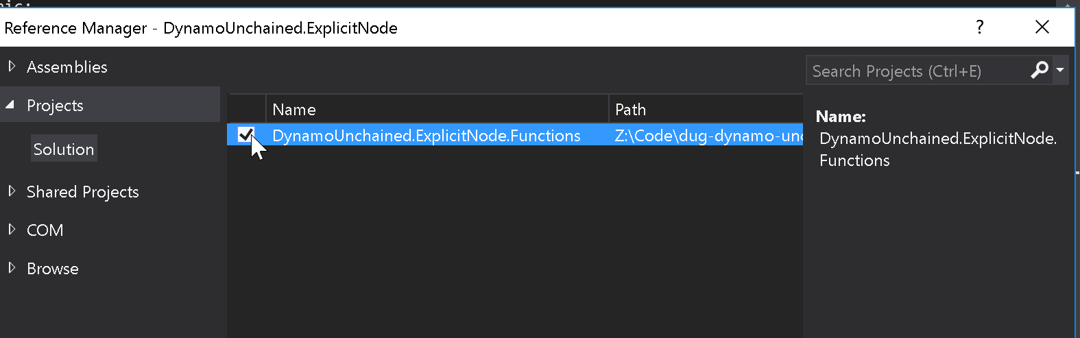
Now we can implement BuildOutputAst inside of HelloUI.cs. First right click on theDynamoUnchained.ExplicitNode project and add a reference to DynamoUnchained.ExplicitNode.Functions.
Then edit HelloUI.cs:
using System;
using System.Collections.Generic;
/* dynamo directives */
using Dynamo.Graph.Nodes;
using ProtoCore.AST.AssociativeAST;

namespace DynamoUnchained.ExplicitNode
{
  [NodeName("HelloUI")]
  [NodeDescription("Sample Explicit Node")]
  [NodeCategory("DynamoUnchained")]
  [InPortNames("A")]
  [InPortTypes("double")]
  [InPortDescriptions("Number A")]
  [OutPortNames("Output")]
  [OutPortTypes("double")]
  [OutPortDescriptions("Product of two numbers")]
  [IsDesignScriptCompatible]
  public class HelloUI : NodeModel
  {
    public HelloUI()
    {
      RegisterAllPorts();
    }

    private double _sliderValue;

    public double SliderValue
    {
      get { return _sliderValue; }
      set
      {
        _sliderValue = value;
        RaisePropertyChanged("SliderValue");
        OnNodeModified(false);
      }
    }

    public override IEnumerable<AssociativeNode> BuildOutputAst(List<AssociativeNode> inputAstNodes)
    {
      if (!HasConnectedInput(0))
      {
        return new[] { AstFactory.BuildAssignment(GetAstIdentifierForOutputIndex(0), AstFactory.BuildNullNode()) };
      }
      var sliderValue = AstFactory.BuildDoubleNode(SliderValue);
      var functionCall =
        AstFactory.BuildFunctionCall(
          new Func<double, double, double>(Functions.Functions.MultiplyTwoNumbers),
          new List<AssociativeNode> { inputAstNodes[0], sliderValue });

      return new[] { AstFactory.BuildAssignment(GetAstIdentifierForOutputIndex(0), functionCall) };
    }
  }
}
And the slider in MyCustomControl.XAML to:
<Slider
  Name="ValueSlider"
  Grid.Row="1"
  Width="100"
  Margin="5"
  HorizontalAlignment="Left"
  VerticalAlignment="Top"
  IsSnapToTickEnabled="True"
  TickFrequency="1"
  Value="{Binding SliderValue}" />
And finally, we need to tell Dynamo to load DynamoUnchained.ExplicitNode.Functions.dll as well, and that’s done by editing pkg.json adding at the end:
"node_libraries": [
"DynamoUnchained.ExplicitNode, Version=1.0.0.0, Culture=neutral, PublicKeyToken=null",
"DynamoUnchained.ExplicitNode.Functions, Version=1.0.0.0, Culture=neutral, PublicKeyToken=null"
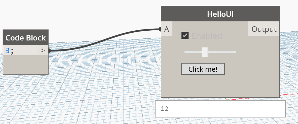
] You can now test your code and see how the input is multiplied by the value of the slider:
Affecting the graph
You might have not noticed it, but with the current implementation the custom node is already affecting the graph. Every time the slider is moved its value changes, and it has a binding with the SliderValue property in HelloUI.cs which then calls the OnNodeModified() method telling Dynamo that one of its nodes has changed and needs to be recomputed.
There is much more you can do with NodeModels as dynamically add or remove ports, affect their state, show warning/error messages etc…
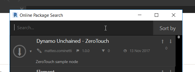
Publishing nodes to the Package Manager
Publishing a package to the package manager is a very simple process especially given how we have set up our Visual Studio projects. Only publish packages that you own and that you have tested thoroughly!
Publishing can only be done from Dynamo for Revit or Dynamo Studio, not from the Sandbox version.
Click on Packages > Manage Packages…
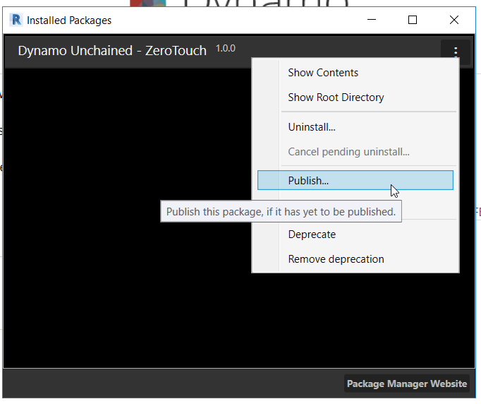
In the next screen make sure all the information is correct and that only the required dlls are being included (remember when we had to manually set Copy Local to False on the references?).
As you click Publish Online it will be on the Package Manager, to upload new version use Publish Version... instead.
Also note that packages cannot be deleted, but only deprecated.
Conclusion
We have seen the principles behind explicit custom nodes, and this workshop has given you the basis to get started with development. There are some technical challenges but also great benefits if you decide to build and use this type of custom node. WPF is a very powerful and widely useful framework, you’ll be able to find lots of resources online and existing UI components to reuse. We have also seen how to publish your nodes online and contribute to the Dynamo community, if is a very straightforward process once you have set up your project correctly. Happy coding!
Additional Resources
- C# Interfaces: https://www.tutorialspoint.com/csharp/csharp_interfaces.htm
- WPF Tutorial: https://www.tutorialspoint.com//wpf/index.htm